Connect.(Spring 2021)
The student health department at the university was ordered to invest in preventive healthcare for new and lonely students, as the university had seen a rise in mental healthcare problems during the pandemic. The Connect project was started together with my team with the purpose to explore concepts on digital services that could prevent and help students cope with loneliness. The project team was consisting of four students from the university and one representative from the health department. The process was planned in agile sprints using a GANTT style schedule.
We developed a concept that would be used as a platform where students at the university could get the opportunity to join social groups depending on different interests. At the end of the project, a final prototype was sent to a third-party developer and the final documentation of the project was handed over to the student health department.
Lessons learned
The project was very interesting and gave me a lot of insights and knowledge on how to work with sensitive subjects where it might even be impossible to meet real users. Because of the sensitivity of the subject, I also learned how to work with confidential information and people working under professional secrecy


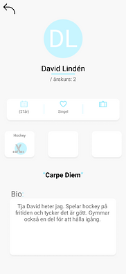
Concept images for the app Connect
Our design process was structured after the classical double diamond with the four stages: Discover, Define, Develop och Deliver. We worked a lot of sketching, wireframes, and mockups throughout the entire process and in total, the concept was developed from over 500 frames in Figma.
In my opinion, these were the most important parts of the process.
Sensitive subject:
As the project was centered around loneliness and mental health which can be seen as a sensitive subject we understood early in the process that we wouldn’t be able to meet and interview end-users.
For this reason, we developed a customized work process where we focused on qualitative user-centered focus without intervening with actual users. To do so we used a lot of already existing research on the subject and read reports done by other health departments at different Swedish universities and from the Folhälsovårdsmyndigheten. We also interviewed people with insights into student behaviors, mostly this interview was conducted with people working at the student health department, although they could not answer some of the questions because of professional secrecy we still could gather a lot of insights into student behavior.
App
Early in the process, we got the wish from the student health department that the digital service we developed could not interfere with the daily work of the staff, especially because the workload had increased under the pandemic. We, therefore, explored different ideas that could be used together with the health department but would not increase their workload. We chose to develop a concept in form of an app that would work independently from the health department but they would gain access to a specially designed admin interface so they could still monitor the activity in the app.
Evaluation
One crucial aspect in our process was how to work with the challenge in understanding how the lonely student felt whit out the option to meet and interview them. Through research and interviews with people that had insights into mental health problems among university students. We learned that a lot of students felt more secure when they were allowed to be anonymous. But at the same time, they felt less secure when they had to interact with other anonymous people.
To explore the anonymous paradox, we tested a lot of different ideas, wireframes, and prototypes to find the balance between opens and anonymity. A total of almost 200 wireframes were created in Figma to find the balance.
We also conducted evaluations together with students from Halmstad University. The evaluation was conducted in three steps, first, the participants were asked to create a profile and fill in the information that they were comfortable with sharing. They were then asked to go through several profiles from other students, these profiles were however fake but this information was kept from the participants. In the second step of the evaluation, the participants were asked to choose one of three workshops to participate in. The participants could see other participants and were asked to explain their choice. The last step of the evaluation consisted of interviews with the participants.
The evaluation made it possible for us to understand what kind of information was crucial for the profile page to feel personal without making the users uncomfortable. We also learned which information was too personal or didn't need in the profiles.


Figma prototype that were used during the evaluation
Color theme
One demand that we got from the student health department was that the digital service should be easily recognizable by the students but preferably should not be too closely associated with the school, studies, or exams. The most straightforward solution to this problem was by choosing a color theme that would be easily recognizable but at the same time not look like the color theme used by Halmstad University.
The color theme was chosen by analyzing the color used by the most popular social apps on the market like Instagram, GoFriendly, and Tinder. The analysis resultin in that majority of social apps uses a warmer color palette and often different subtle use of gradients. We developed a couple of different color themes for the Connect app and asked different students to give feedback on the colors. After the feedback, we removed the color themes that were too closely associated with the university, and then we choose an orange/purple color palette that fitted well with the context of the app.


Color theme mockups